top of page

BRANDING
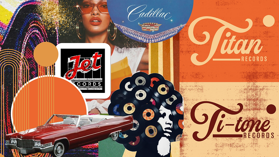
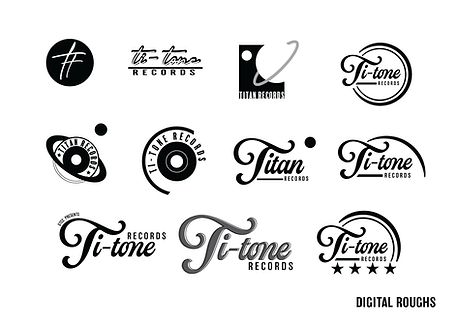
Ti-Tones is a student run record label formed at Guilford Technical Community College. The label wanted a 70’s retro and grungy design for the label logo. I used colors such as orange and cream to push the 70’s aesthetic while also nodding to the school’s colors. The curves in the main logo are to be reminiscent of a record and the sunset as one of the references was the film Almost Famous. The round secondary logo makes use of the elaborate “T” and is a nod to the arm found on a record player.
ti-tones


bottom of page